
Designing An Auto Garage Mobile App – Lessons From Launch

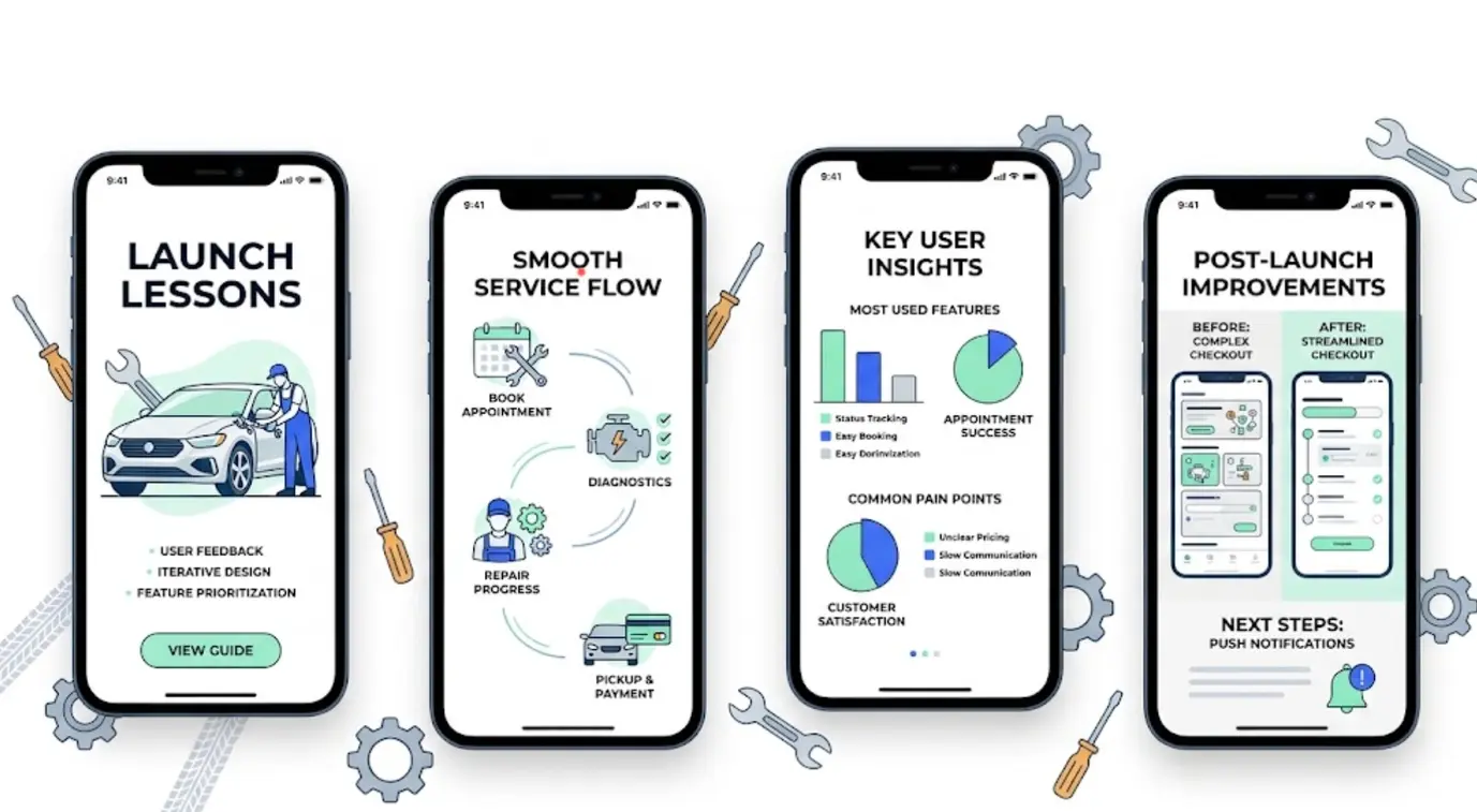
Designing an auto garage mobile app comes down to solving one awkward fact: a normal driver visits a garage two or three times a year, so an app built around booking alone gets installed once, used once, and forgotten. The work that made a difference in this project was not the booking screen at all. It was removing account creation, letting people start with nothing but a number plate, showing photographs from the workshop while the car was still on the ramp, and letting customers approve extra repair work with one tap instead of a phone call nobody answers. The garage side mattered just as much, because an app that slows a technician down will be quietly abandoned no matter how good it looks in a portfolio. What follows is the full account of what we tested, what we got wrong, what the numbers looked like afterwards, and the cases where I would tell a garage owner not to build an app at all.
| Decision We Made | What It Replaced | Why It Mattered |
|---|---|---|
| Number plate as the starting point | Account creation and vehicle setup | Removed the biggest drop off in the flow |
| Photo updates from the bay | Silence until the car was ready | Reduced anxious phone calls |
| One tap approval for extra work | Phone tag between advisor and customer | Cut technician idle time |
| Free text problem description | A dropdown of service types | Matched how people actually describe faults |
| Prices visible before booking | Prices given only over the phone | The single strongest trust signal we found |
| Web version alongside the app | App only access | Caught the majority who will never install anything |
The Problem Nobody Warns You About Before You Start
Most app projects quietly assume frequency. Food ordering, banking, messaging and transport are all opened weekly or daily, so the install pays for itself within a fortnight. Car servicing is nothing like that, and pretending otherwise is the root of most failed garage apps. If a driver books a service in March and an inspection in November, the app has eight months to become invisible, and the phone’s own tidying features will hide it long before that. A messaging app might be opened hundreds of times a year and a banking app a few dozen. A garage app built only for booking gets opened twice, maybe three times, which is not enough for anyone to remember it exists.
That single realisation shaped the whole project. We stopped asking how to make booking better and started asking what could reasonably bring somebody back between visits. The honest answers were narrow, and worth listing because most feature workshops produce a far longer list than this one.
- A reminder before a legal inspection or service is due, which is the only alert most drivers welcome
- Somewhere to keep service records, which becomes valuable at the moment of resale
- A safety recall notice for their specific vehicle
- Invoices and receipts they might need for a warranty claim or a company expense
- A record of what was approved and when, which settles arguments later
Everything else we brainstormed was a fantasy about how much drivers think about their cars. Anything that assumes affection for the vehicle, or interest in maintenance as a subject, will be used by a small enthusiast minority and nobody else.
The App Has Two Users And They Want Opposite Things
Every garage app is really two products sharing a database. Confusing them is how projects end up with a beautiful customer screen and a workshop tablet nobody touches. The car owner and the technician want almost opposite things from the same information, and the design has to hold both without compromising into something that suits neither.
- Main goal: the owner wants to know what it costs and when it will be ready, while the workshop wants to move cars through the bays without interruptions
- Time on screen: a few minutes twice a year for the owner, and most of the working day for staff
- Conditions of use: a sofa, an office or a bus for one, and oily gloves, bright light and patchy signal for the other
- Tolerance for slow loading: low for customers, and effectively zero for technicians who are being watched by the clock
- Biggest frustration: silence and surprise costs on the customer side, chasing people for approval on the workshop side
- What earns trust: photographs and clear pricing for the owner, and fewer phone calls for the staff
Rob, the workshop foreman we worked with, put the staff side more plainly than any research summary could. His view was that any screen a technician has to take gloves off for will be used twice and then ignored, and that the only feature the workshop genuinely wanted was a faster yes from the customer. He was right, and that one comment reordered our whole backlog.
What Twelve Customers Showed Us In A Waiting Room
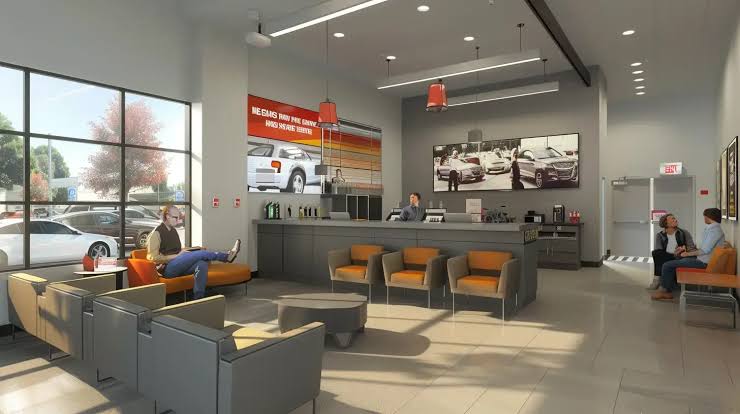
We ran short usability sessions with twelve customers in the waiting area of one garage over three weeks, plus three technicians in the workshop. This is a small sample from a single site and not a formal study, so treat it as a pattern that pointed us in the right direction rather than a statistic. The findings were consistent enough to act on immediately.
- Nobody could recall their vehicle identification number, and four could not recall their own registration without checking a document or walking outside
- Every person asked about price within the first minute, before dates, before location, before anything else
- Half described their problem as a noise or a feeling rather than a part, so the service dropdown was useless to them
- Two customers assumed the booking had failed because no confirmation arrived immediately
- Older customers pinched to zoom on the price breakdown, which told us the type was too small before any accessibility audit did
- Every customer said they would rather see a photograph of the fault than be told about it over the phone
- Technicians disliked any flow with more than two taps, because both hands were rarely free
That last pair of findings turned out to be the same insight arriving from two directions. A photo taken by the technician answers the customer’s question, proves the work is needed, and takes less time than a phone call. It became the centre of the design rather than a nice extra we would add later.
Why Number Plates Beat Account Creation
Our first prototype asked for an email address, a password, a vehicle make, a model, a year and a fuel type before showing a single price. It tested badly enough that we rebuilt the entry flow completely. A registration lookup fills in most of those fields on its own, and phone number verification replaces the password entirely. Watching where people stopped made the ranking obvious.
- Email and password first: people stopped at the password screen, and several said out loud that they did not want another account
- Full manual vehicle details: people stalled at fuel type and engine size, which many owners simply do not know
- Social sign in: abandoned at the permissions prompt, with suspicion about what the garage would see
- Registration plate followed by a phone code: very few drop offs, and adopted as the main route
- Guest booking with no login at all: almost no drop offs, and kept alongside the plate lookup
The principle worth carrying into any similar project is that identity should be collected at the moment it becomes useful, not before. A person booking a repair is perfectly happy to confirm a phone number when it secures an appointment, and completely unwilling to invent a password just to see a price.
The Booking Flow That Kept Failing
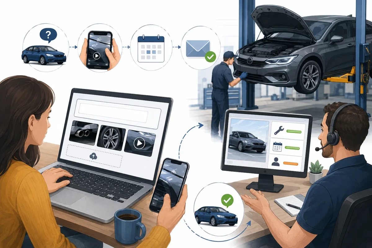
Service menus are written by garages for garages. A customer with a rattle does not know whether they need diagnostics, a suspension check or an exhaust inspection, and forcing that choice makes them guess wrong or give up entirely. We replaced the menu with a description box, an option to attach a photo or a short video, and a plain route for people who are not sure.
- A free text field with examples underneath, since blank boxes intimidate people more than designers expect
- Attachments made optional, because most customers will not stand in a car park filming a noise
- A clear “I am not sure what is wrong” path that books a diagnostic slot instead of forcing a guess
- Estimated price ranges rather than exact figures for unknown faults, with the range explained in one sentence
- A written confirmation on screen and a message within a minute, which removed the doubt we saw in testing
- The ability to change or cancel without phoning, which the garage resisted at first and later credited for fewer no shows
The garage’s fear was that vague bookings would waste workshop time. The opposite happened, because a description in the customer’s own words gave the service advisor far more to work with than a dropdown choice ever had.
Closing The Silence Gap While The Car Is In The Bay
The worst part of the customer experience is the middle. You hand over the keys in the morning and hear nothing until somebody calls with a number you were not expecting. That gap is where trust is lost, and it is also the cheapest part of the whole journey to fix, because the information already exists inside the workshop. It simply never reaches the person waiting.
- At check in, a status card with a time estimate replaced a verbal promise made across a counter
- After the inspection, photographs of anything found appeared with plain descriptions, where previously there was nothing at all
- When extra work was needed, a priced list to approve or decline replaced a phone call that was often missed
- During the work itself, a simple progress state replaced the silence that generates chasing calls
- At collection, a message with the invoice attached replaced another phone call
Keep the language non technical in these updates. Something like “front brake pads are worn to two millimetres, which is below the safe limit” works. A part number does not. We also learned to ask for notification permission at the moment the car was checked in rather than at first launch, because a customer who has just handed over their keys understands exactly why the app wants to message them.
Approving Extra Work Without Phone Tag
This was the feature the business cared about most, and the one that justified the project financially. When a technician finds additional work, the car sits still until the customer says yes. Every minute of that is an occupied ramp earning nothing, and in a busy workshop those minutes stack into whole days across a month.
- Waiting time for a decision fell from hours, sometimes a full day, to under an hour in most cases
- Several chasing phone calls became one notification with the prices already listed
- Disputes about agreed cost dropped sharply, because the approval was recorded with a timestamp
- Slightly fewer customers declined the extra work when photographs were attached to the request
- Service advisors stopped spending their afternoons leaving voicemails, which they mentioned unprompted
The record of approval turned out to be as valuable as the speed. A timestamped list of what was authorised, with photographs attached, ended almost all of the arguments that used to happen at the counter when the bill came out.
Designing For Oily Hands And Bright Sunlight
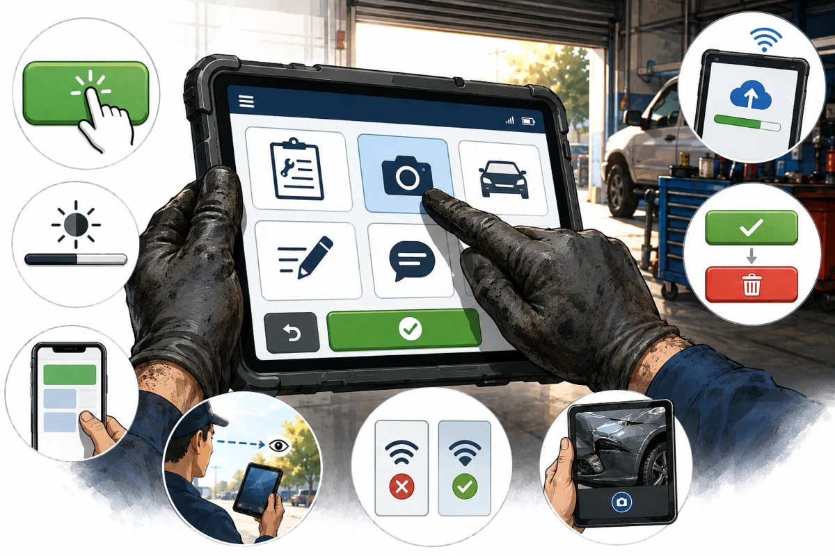
The workshop side needs a different visual language from the customer side. Screens are used at arm’s length, in daylight, with dirty gloves, in a metal building where signal drops without warning. Platform guidance covers the basics of touch target sizing, and both the Apple Human Interface Guidelines and the Android accessibility guidance for developers set minimum sizes that are worth treating as a floor rather than a target in this setting.
- Buttons noticeably larger than the platform minimum, because gloved fingers are imprecise
- High contrast throughout, since a screen washed out by sunlight through a roller door is unreadable
- Nothing important placed in a corner that needs a second hand to reach
- Offline tolerance, so a photo taken in a dead spot uploads later instead of vanishing
- Destructive actions kept well away from common ones, because mis-taps happen constantly
- Text large enough to read from arm’s length rather than normal reading distance
- Camera access from one tap on the job card, which became the most used control in the entire product
Making It Usable For Every Customer
Garage customers skew older than the average app audience, and a good number have limited confidence with phones. We audited against the Web Content Accessibility Guidelines published by the W3C, and the changes that came out of it improved the app for everyone rather than only for people with a stated need.
- A larger base type size was meant for older customers and helped everyone reading in a car park
- Contrast increases were made for low vision users and helped anyone outdoors
- Labels on every icon were added for screen reader users and rescued new customers who could not guess what the icons meant
- Removing colour as the only status indicator was aimed at colour blind users and helped everyone glancing quickly
- Simpler wording throughout was written for second language speakers and tested better with every single participant
Plain language deserves particular attention in this sector. Repair work carries technical vocabulary that customers rarely know, and replacing it costs nothing while removing a genuine barrier between the garage and the person paying the bill.
Features We Built That Nobody Used
Being honest about the waste is the most useful part of any case study, since these decisions consumed weeks of a real budget. Every one of them looked reasonable on a whiteboard.
- Loyalty points were built because the owner wanted repeat visits, and were barely opened, since visits are too rare for anyone to accumulate anything worth having
- In app chat felt modern and failed in practice, because staff could not monitor it during busy periods, so replies came late and trust dropped
- Social sharing of service milestones came from a suggestion in a workshop and was used by nobody at all
- Dark mode was a developer preference that worked perfectly well, solved no user problem, and delayed the launch
- Video upload from customers assumed people would film noises, when filming a fault is awkward and the files are large
- A full maintenance encyclopaedia was meant to add value and was ignored, because people search the web for this instead
The pattern across all six is the same. Each came from inside the project rather than from anything a customer or a technician said in a session. In hindsight we should have applied one rule from the beginning, which is that if no user in testing asked for it, it waits until after launch.
What The Numbers Looked Like After Launch
These figures come from one garage group over the first several months, so read them as a direction of travel rather than as a benchmark you can promise a client. Small independent sites and large chains behave differently, and a single group is a single group.
| Measure | Direction After Launch | Notes |
|---|---|---|
| Booking completion rate | Up substantially | Almost all of it from removing account creation |
| Inbound phone calls | Down noticeably | Mostly status calls, which the updates replaced |
| Time to approve extra work | Down sharply | The clearest financial win of the project |
| App retention between visits | Poor | Reminders helped, but the frequency problem remains real |
| Web bookings | Higher than app bookings | Confirmed the decision to build both |
| Review scores mentioning communication | Improved | Photos were named repeatedly in written reviews |
The uncomfortable result sits in the fifth row. More people booked through the browser than through the installed app, which is exactly what the frequency problem predicts. That is not a failure of the design, but it is a strong argument against any project that treats the app as the only channel worth having.
What I Would Do Differently Next Time
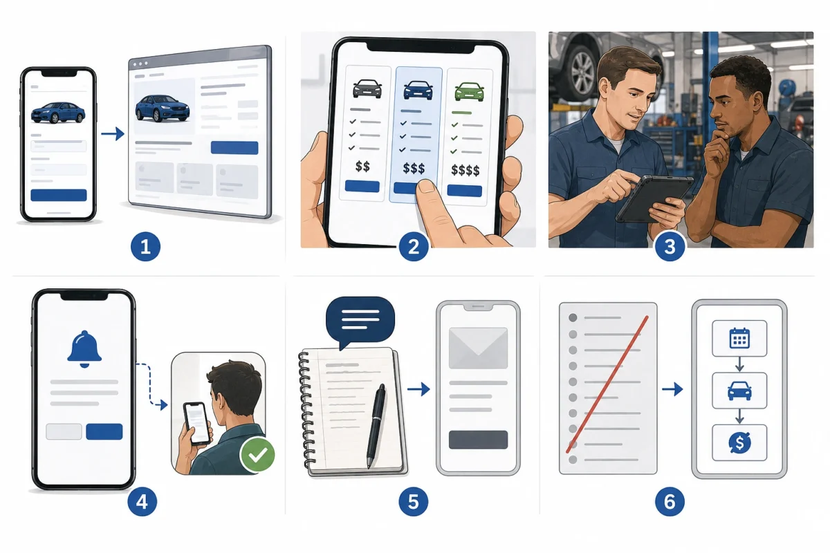
- Build the mobile web version first and treat the app as the second step, not the reverse
- Test how pricing is presented before testing anything else, because it dominates the first minute of every session
- Put the workshop tablet in a technician’s hands in week one rather than week six
- Delay every notification permission prompt until the moment it makes obvious sense to the person seeing it
- Write the plain language content before the interface, since the words end up shaping the screens
- Cut the feature list in half at the start and spend the time saved on the three flows that carry the business
When A Garage Should Not Build An App At All
This is the part most agency case studies leave out, so here it is plainly. An app is a poor fit for a great many garages, and pretending otherwise wastes money that would do more good elsewhere.
- A single site with a loyal local customer base is better served by a fast mobile website with click to call and online booking
- A garage with fewer than a few thousand active customers will get more from text message reminders and a simple booking page
- A business with no staff member who can own the software should build nothing until somebody can, because an unmaintained app damages trust
- Customers who mostly phone anyway are better served by improved phone handling than by a product they will not install
- If the main goal is inspection reminders, official services already do this free, such as the MOT reminder service on GOV.UK for drivers in the United Kingdom
- If the main goal is winning new customers, local listings and reviews matter far more, since nobody installs an app for a garage they have never used
An app makes sense when a garage has multiple sites, a large repeat customer base, staff who will keep it updated, and a genuine operational problem that faster approvals or fewer calls would solve. Recall checking is one of the few reasons a customer opens such an app unprompted, and in the United States that data is publicly searchable through the recall lookup published by NHTSA, which is worth linking to rather than rebuilding from scratch.
Questions Garage Owners Ask Me Most
How long does a project like this take? A focused first version with booking, status updates and approvals took months rather than weeks, and the workshop side took longer than the customer side because it had to survive real daily use.
Should the app show prices? Yes, or at least honest ranges. Hiding prices was the most common complaint in every session we ran, and it pushes people towards competitors who publish theirs.
Will customers really use photo updates? They were the most praised feature in reviews after launch. People believe a photograph in a way they do not believe a description over the phone.
What about a customer who refuses to use any app? Keep the phone line and the counter exactly as they were. An app should reduce load on those channels, never replace them.
Is it worth building for both platforms at once? Build the web version for everyone first, then decide. That order gives you real usage data before the expensive part starts.